
Surveys App Configuration and Workflow Guide
Marketing Cloud: Surveys App Configuration and Workflow Guide
This document provides a comprehensive guide to the Surveys App in CloudOffix, detailing the Configuration menu, its menu items, critical fields, and an example workflow for creating and managing surveys.
For more information about configuring Marketing Cloud please refer to the Marketing Cloud General Settings Configuration Guide: [ Marketing Cloud General Settings Configuration Guide ]
1. Configuration Menu Overview
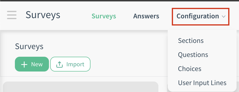
The Configuration menu in the Surveys App, accessible under Surveys App > Configuration, is available to users with Survey / Manager access rights. This menu allows administrators to customize settings and manage key components of survey management. Below are the primary menu items and their functions.
1.1 Configuration Menu
-
Sections:
Purpose: Stores all sections created across surveys.
Functionality: Opens grouped by Survey by default (sections are listed under the survey they belong to).
-
Questions:
Purpose: Stores all questions created across surveys.
Functionality: Opens grouped by Section by default (questions are nested under their parent section).
-
Choices:
Purpose: Stores all answer choices that are defined for questions.
Functionality: Opens grouped by Question by default (choices are listed under the question they belong to). It brings choices that are added to the multiple choice and matrix question types.
-
User Input Lines:
Purpose: Displays the individual answer lines (responses) submitted by participants for every question across all surveys. Each line represents a single response to a specific question from a specific user/participant session.
Functionality: Opens grouped by Survey by default.
2. Menu Items
-
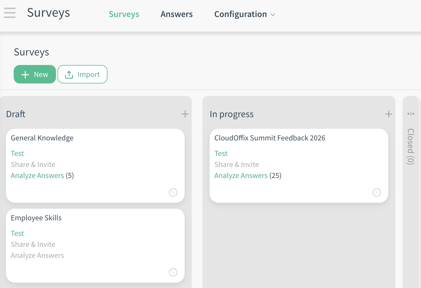
Surveys:
Purpose: Central hub for creating, editing, and publishing surveys.
Functionality: Create new surveys, change stages on the kanban with drag-and-drop, and use shortcuts on the kanban view (e.g., analyze answers, share and invite).
-
Answers: Opens grouped by Survey by default.
Purpose: Repository of all submitted survey responses.
Functionality: Opens grouped by Survey by default (all answers for one survey together). View detailed responses: respondent info (if known), submission date, answers to each question. Use filters (e.g., Completed), and group by (e.g., Partner) to search quickly and effortlessly.
3. Critical Fields
The following fields are critical for effective survey creation and management:
3.1 Critical Fields - Survey Creation
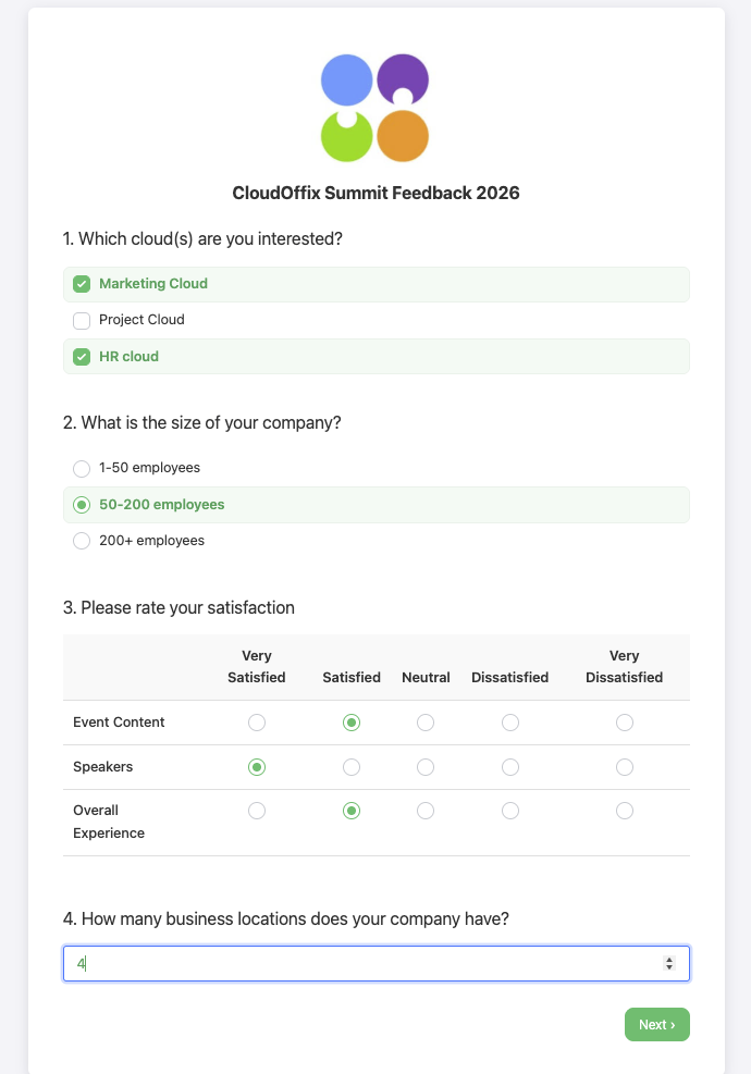
Survey Title: The main name of the survey (e.g., ‘CloudOffix Summit 2025 Feedback’, ‘Post-Webinar Survey’). Appears as the title on the survey page.
Tabs (on the survey form):
-
Questions Tab: The core builder where you add sections/pages and questions.
Add a section: Creates a new logical section/page (e.g., ‘Demographics’). Give each section a title.
Add a question: Adds a new question inside the current section/page (if a section/page is created).
Question: The actual question text (e.g., ‘How satisfied were you with the event?’).
Type of question: Choose from the options (see below for available question options).
Tabs (inside the question):
Answers: Based on the selected question type, write the answers/choices here.
Description: Optional explanatory text shown directly below the question while the respondent is filling out the survey.
-
Options:
Mandatory Answer: Makes the question required (user must answer to proceed).
Error message: Custom message shown if the user tries to proceed without answering a mandatory question (e.g., ‘Please select at least one option’).
-
Link to Partner Field: Maps the answer directly to the selected field on the respondent’s contact/partner record.
Can be used to collect information from the survey (such as name and email) to create a new contact.
-
Validate entry: Enables validation rules for the user's answer. Available for: Single Line Text Box, Numerical, Date
Minimum: Sets the lowest allowed value for the answer. The exact meaning depends on the type of question selected.
Maximum: Sets the highest allowed value for the answer. The exact meaning depends on the type of question selected.
Validate Error message: Custom error message shown to the user if validation fails (e.g., ‘Please enter at least 10 characters.’)
-
Allow Comments:
-
Show Comments Field:
Mandatory Comment: Makes the comments field required if the user selects a specific choice. You can specify when the comment field is mandatory or not from the ‘Mandatory’ column in the ‘Answers’ tab.
Error message: Custom error message shown to the user if they fail to provide a mandatory comment (e.g., ‘A comment is required.’).
Comment message: Custom label/text for the comments field (e.g., ‘Please tell us more about your choice’, ‘If other, please specify:’).
Comment Field is an Answer Choice: Treats the comment as one of the selectable answers (only available for multiple choice question types).
-
-
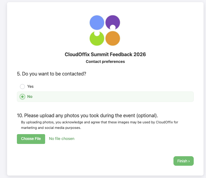
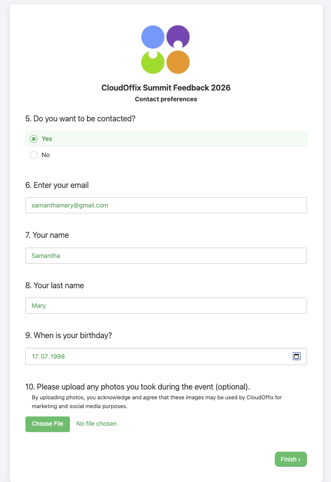
Conditional Display: Show/hide this question based on previous answers.
Triggering Answers: Select which previous answers trigger this question (e.g., If the answer is ‘Yes’ to the previous questions → show this question)
Types of questions:
Multiple Line Text Box: Allows long, free-text answers (e.g., ‘Please share your feedback or suggestions’)
-
Single Line Text Box: For short, single-line answers.
-
Answers tab:
Input must be an email: Automatically validates the format (must contain @ and valid domain).
-
Numerical Value: Accepts only numbers (e.g., ‘How many employees in your company?’)
Date: Provides a calendar picker for selecting a date (e.g., ‘What is your birthdate?’)
-
Multiple choice: only one answer: This question type allows respondents to choose only one option from a list of choices.
-
Answers tab:
Import from file: Lets you bulk-import a large number of answer choices from an external file instead of adding them one by one manually.
Add an item (Choices): Add each possible answer. Click Add an item for each choice.
Tooltip: A small note or hint that appears only when the user hovers the mouse over the choice/answer.
Score for this choice: Assign points to each option. Useful for quizzes or weighted surveys.
Mandatory: In the Options tab, when you enable the Show Comments Field and check the Mandatory Comment checkbox, you can then decide exactly which answer choice(s) should require a comment. Simply go to the Answers tab and tick the Mandatory column next to the specific choice(s) where the comment becomes required (e.g., only for ‘Other’ or ‘Dissatisfied’). This way, the comment field is only mandatory for the selected answers — for all other choices, it remains optional.
-
Options Tab:
Mandatory Answer: User must answer the question to proceed. If unchecked, the question is optional.
Error message: Custom message shown if the user tries to proceed without answering a mandatory question (e.g., ‘Please select at least one option’).
Link to Partner Field: Maps the answer directly to the selected field on the respondent’s contact / partner record.
-
Display mode: Controls how choices appear to the respondent.
-
Format:
Radio Buttons: Number of Answers Columns: Arrange choices in multiple columns. Question Tooltip: A small note or hint that appears only when the user hovers the mouse over the question.
Selection Box: Question Tooltip: A small note or hint that appears only when the user hovers the mouse over the question.
-
-
Allow comments:
-
Show Comments Field:
Mandatory Comment: Makes the comments field required if the user selects a specific choice. You can specify when the comment field is mandatory or not from the ‘Mandatory’ column in the ‘Answers’ tab.
Error message: Custom error message shown to the user if they fail to provide a mandatory comment (e.g., ‘A comment is required.’).
Comment message: Custom label/text for the comments field (e.g., ‘Please tell us more about your choice’, ‘If other, please specify:’).
Comment Field is an Answer Choice: Treats the comment as one of the selectable answers.
-
-
-
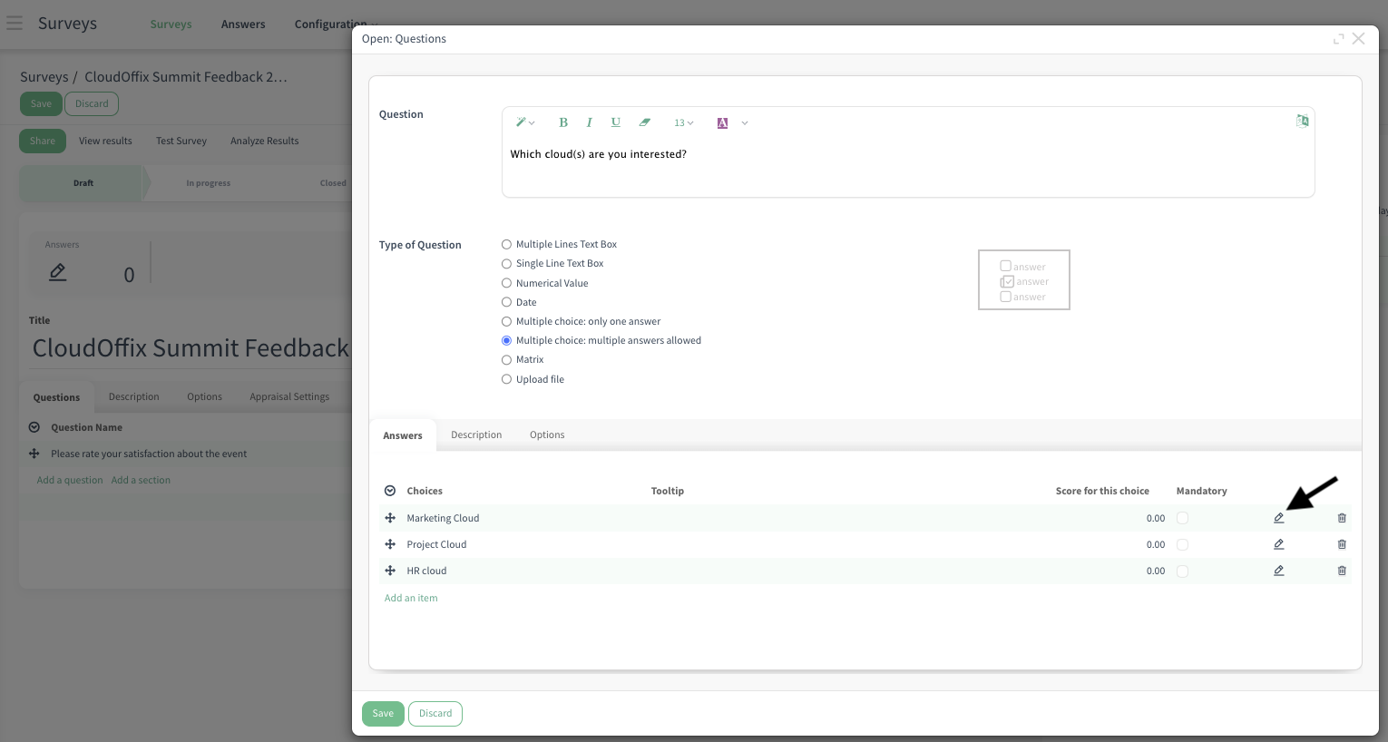
Multiple choice: multiple answers allowed: This question type allows respondents to choose more than one option from a list of choices.
-
Answers Tab:
Import from file: Lets you bulk-import a large number of answer choices from an external file instead of adding them one by one manually.
Add an item (Choices): Add each possible answer. Click Add an item for each choice.
Score for this choice: Assign points to each option. Useful for quizzes or weighted surveys.
Tooltip: A small note or hint that appears only when the user hovers the mouse over the choice/answer.
Mandatory: In the Options tab, when you enable the Show Comments Field and check the Mandatory Comment checkbox, you can then decide exactly which answer choice(s) should require a comment. Simply go to the Answers tab and tick the Mandatory column next to the specific choice(s) where the comment becomes required (e.g., only for ‘Other’ or ‘Dissatisfied’). This way, the comment field is only mandatory for the selected answers — for all other choices, it remains optional.
-
Options Tab:
Mandatory Answer: User must answer the question to proceed. If unchecked, the question is optional.
Error message: Custom message shown if the user tries to proceed without answering a mandatory question (e.g., ‘Please select at least one option’).
Link to Partner Field: Maps the answer directly to the selected field on the respondent’s contact / partner record.
-
Display mode: Controls how choices appear to the respondent:
Number of Answers Columns: Arrange choices in multiple columns
Question Tooltip: A small note or hint that appears only when the user hovers the mouse over the question.
-
Allow Comments:
-
Show Comments Field:
Mandatory Comment: Makes the comments field required if the user selects a specific choice. You can specify when the comment field is mandatory or not from the ‘Mandatory’ column in the ‘Answers’ tab.
Error message: Custom error message shown to the user if they fail to provide a mandatory comment (e.g., ‘A comment is required.’).
Comment message: Custom label/text for the comments field (e.g., ‘Please tell us more about your choice’, ‘If other, please specify:’).
Comment Field is an Answer Choice: Treats the comment as one of the selectable answers.
-
-
-
Matrix: This question type displays a grid where respondents rate or select options across multiple rows and columns (e.g., ‘Rate your satisfaction with each session” with rows as sessions and columns as rating levels like ‘Very Satisfied’ to ‘Very Dissatisfied’).
-
Answers Tab:
Columns: Define the horizontal options (e.g., ‘Very Satisfied’, ‘Satisfied’, ‘Neutral’, ‘Dissatisfied’, ‘Very Dissatisfied’ or ‘1–5 stars’)
Rows of the Matrix: Define the vertical items to be rated (e.g., ‘AI Workshop’, ‘Networking Lunch’).
Score for this choice: Assign points to each option.
Mandatory: In the Options tab, when you enable the Show Comments Field and check the Mandatory Comment checkbox, you can then decide exactly which answer choice(s) should require a comment. Simply go to the Answers tab and tick the Mandatory column next to the specific choice(s) where the comment becomes required (e.g., only for ‘Other’ or ‘Dissatisfied’). This way, the comment field is only mandatory for the selected answers — for all other choices, it remains optional.
-
Options Tab:
Mandatory Answer: User must select an option for every row to proceed. If unchecked, rows are optional.
Error message: Custom message shown if the user tries to proceed without answering a mandatory question (e.g., ‘Please select at least one option’).
Link to Partner Field: Maps the answer directly to the selected field on the respondent’s contact / partner record.
-
Matrix Type: Controls how selections work in the grid:
One choice per row: Radio buttons per row — user selects only one column per row (e..g, classic Likert scale).
Multiple choices per row: Checkboxes per row — user can select multiple columns per row (e.g., ‘Which features do you use?’ with multiple selections allowed per row).
-
Allow Comments:
-
Show Comments Field:
Mandatory Comment: Makes the comments field required if the user selects a specific choice. You can specify when the comment field is mandatory or not from the ‘Mandatory’ column in the ‘Answers’ tab.
Error message: Custom error message shown to the user if they fail to provide a mandatory comment (e.g., ‘A comment is required.’).
Comment message: Custom label/text for the comments field (e.g., ‘Please tell us more about your choice’, ‘If other, please specify:’).
-
-
-
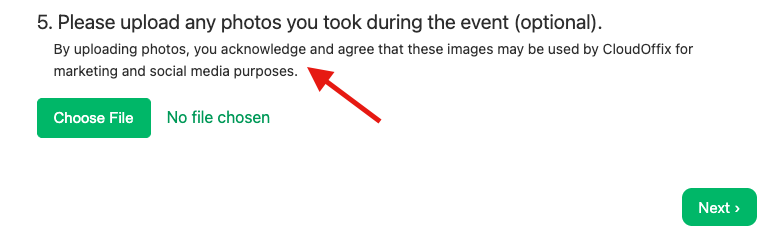
Upload file: This question type allows respondents to upload files (e.g., ‘Upload your presentation’, ‘Send us your photo’).
-
Options Tab:
Mandatory Answer: User must upload a file to proceed. If unchecked, uploading is optional.
Error message: Custom message shown if the user tries to proceed without answering a mandatory question (e.g., ‘Please select at least one option’).
Link to Partner Field: Maps the answer directly to the selected field on the respondent’s contact / partner record (e.g., Notes).
File types allowed: PDF, .xlsx, .csv, docx, doc, jpg/jpeg, png.
Storage: Uploaded files are stored in the related question’s ‘Upload file’ field.
-
Tabs (on the survey form):
Description Tab: This is the introductory text displayed on the survey's main page, before the user starts answering questions. Respondents read this text first — It can be used to explain the survey's purpose, set expectations, provide context, or motivate participation.
-
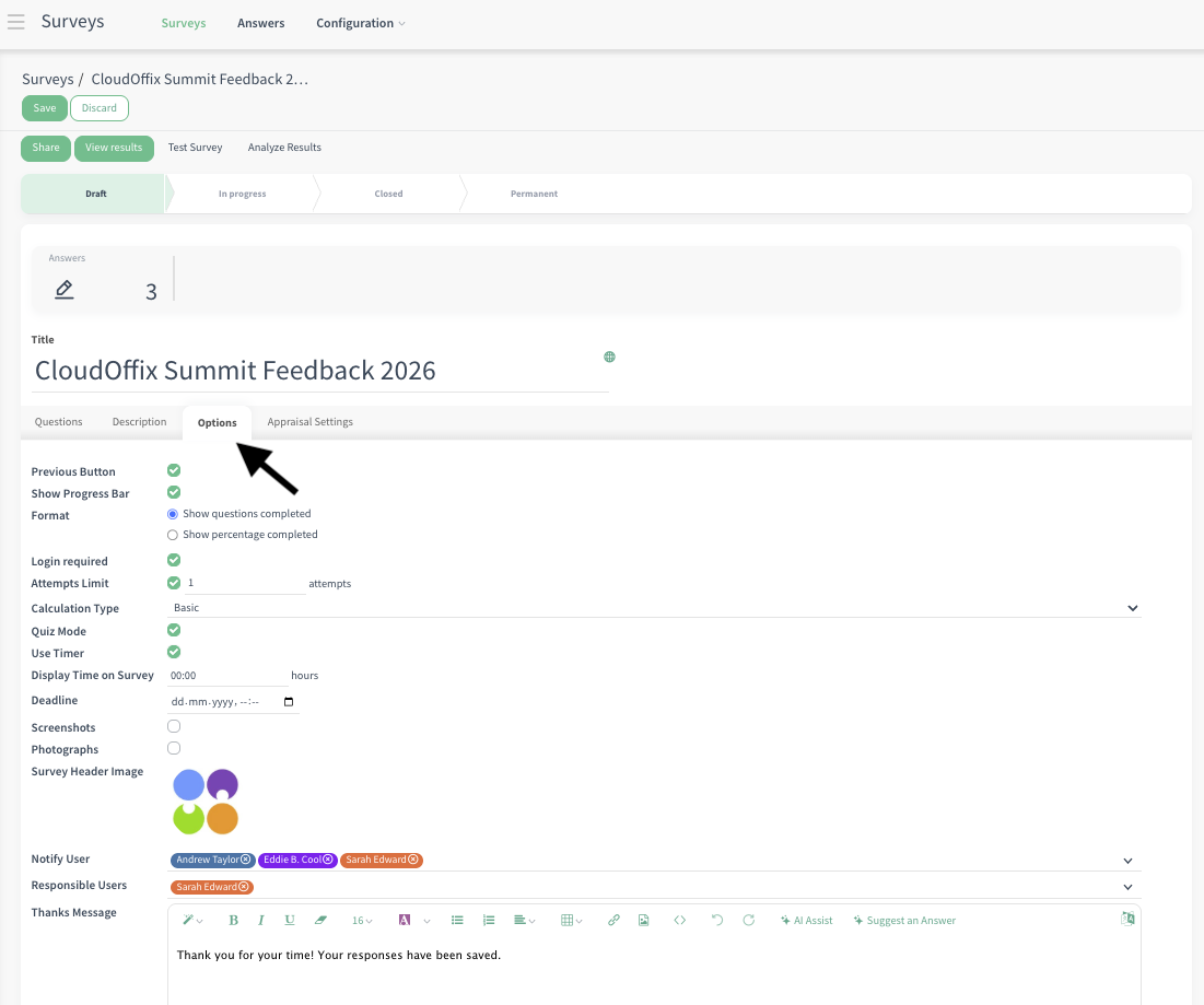
Options Tab: This tab contains global survey settings that affect how the entire survey behaves and appears.
Previous Button: Shows a ‘Previous’ button so users can go back to edit earlier answers.
Show Progress: Displays a progress bar at the bottom of the survey.
Show questions completed: Shows a progress bar at the bottom of the page that moves forward as you answer the questions.
Show percentage completed: Shows the number of questions completed as you answer the questions.
Login required: Users must log in to CloudOffix with their username and password to take the survey.
-
Attempts Limit: Limits how many times a user can submit the survey.
# of attempts: Set the maximum number (e.g., 1 = one attempt only). Default: unlimited
-
Calculation Type: Determines how the final score is calculated.
Basic: Sum of all selected scores (default).
Average: Sum of all selected scores divided by number of questions (Total score / # of questions). If you have 2 questions (5 and 10 points), the total score will be 15 for the basic calculation, for the average calculation it will be 7.5 (15 / 2).
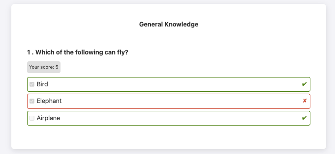
Quiz Mode: Activates quiz features (e.g., shows correct answers).
-
Use Timer: Checkbox (appears only in Quiz Mode): Add a countdown timer for the entire survey.
Display Time on Survey: Set duration (e.g., 30 minutes). When the survey starts a countdown of the remaining time will be shown on the top right to the user.
When the timer hits ‘0’ (zero), the survey will submit itself automatically, even if the user did not finish the whole survey.
Screenshots: By enabling this option, screenshots of respondents’ screens will be taken during the quiz.
Photographs: By enabling this option, photos of respondents’ will be taken during the quiz.
Important: When Quiz Mode is activated, any answer or answers to which you have assigned points are considered correct. For example, if you have options A, B, and C, and you give 5 points each to A and B, then if the user selects C, it is marked as incorrect. In the Review Answers view, a red cross (X) appears next to C, while a green check (✓) appears next to A and B.
Deadline: Set a date and time after which the survey is no longer accessible.
Survey Header Image: Upload an image that appears at the top of the survey page (e.g., event/company logo).
Notify User: When there is a new survey submission, send email notifications to these users selected in this field with survey inputs.
-
Responsible User: The user that is responsible for the survey.
A user assigned as responsible for a survey; if they have Survey / User access rights and are added to the responsible field of a survey they did not create, they are granted permission to edit only that survey, similar to a Survey / Manager.
Thanks Message: Custom message displayed after submitting the survey (e.g., ‘Thank you! Your feedback helps us improve.’).
-
Appraisal Settings Tab:
Expert Level: Lets you define the expertise or seniority levels that can be used when sending 360-degree appraisal surveys.
When you select an Expert Level option (e.g., Junior, Mid-Level, Senior, Expert, Lead), these levels become available when sending an appraisal in the 360 Appraisal app. During the 360 appraisal process, you can select specific Expert Levels to target.
The survey will then be sent only to employees whose Expert Level field on their employee card matches the selected level. This allows you to run targeted 360 appraisals.
For example, send a leadership-focused appraisal only to employees marked as ‘Senior’ or ‘Lead’ on their employee cards.
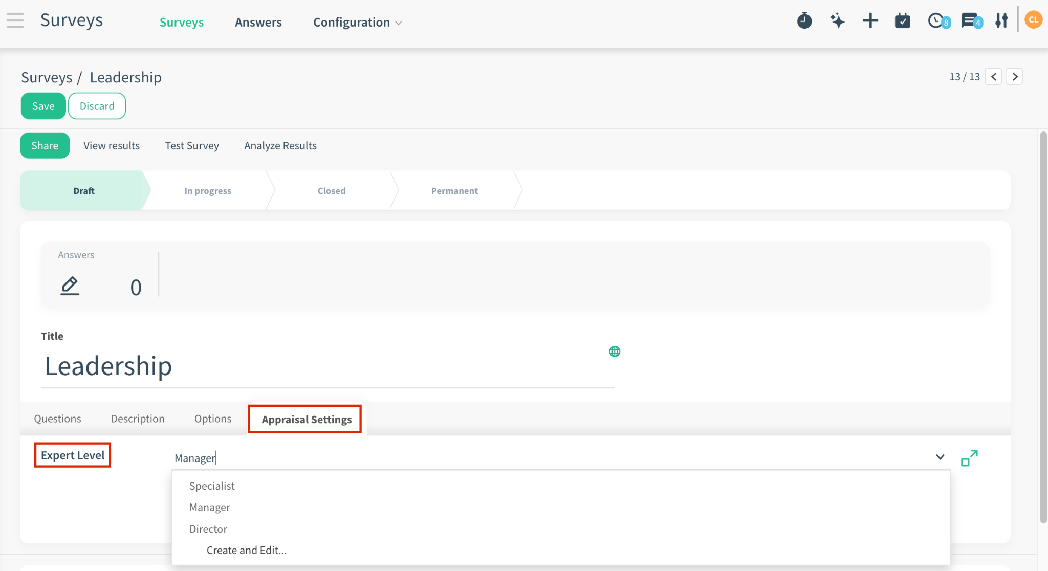
Note: This tab is only visible, if you have HR Cloud and 360 Appraisal app.
3.2 Buttons
-
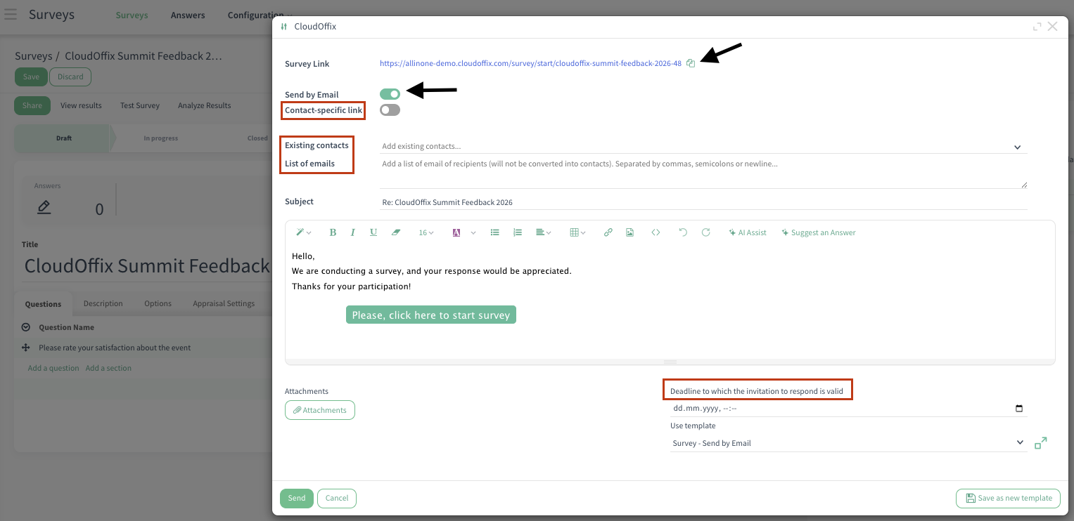
Share: Opens the sharing options to distribute the survey.
Survey Link: Generates a public URL. Copy and share (e.g.,https://cloudoffix.com/survey/start/cloudoffix-summit-feedback-2026-46).
-
Send by Email: A toggle button that, when enabled (turned on), opens additional options for sending survey invitations. When toggled on, it reveals the following fields:
Contact-specific link: Each recipient gets a personalized, unique link.
Existing contacts: Select from your Contacts/Partners database.
List of emails: Add a list of email recipients. Emails must be separated by commas, semicolons or newline. Useful for sending without creating a contact. The emails that you add here will not be converted into contacts.
-
Deadline to which the invitation to respond is valid: Set an expiration date/time for the invitation links.
After this deadline, the survey link becomes inactive for new responses (even if the survey itself is still open).
If the field is empty, the invitation is still valid.
-
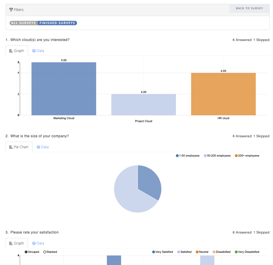
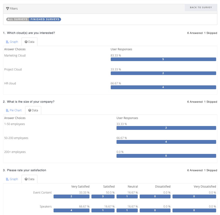
View results: Opens the survey's results — a dedicated page where you can analyze all submitted responses in detail (e..g, number of answered/skipped responses, pie chart view, data table view, text responses).
Both the Analyze Answers option (from the Kanban view) and the View Results button (on the survey record) are accessible and lead to the same results view.
Test Survey: Opens the survey in a real end-user view (exactly how respondents see it). Runs in test mode (responses marked as Test Entry).
Analyze results: Clicking this button instantly downloads the survey responses as an XLSX file, with questions as columns and each respondent's answers as rows.
Stat Button:
-
Answers: Shows the total number of submitted responses for that survey.
Clicking opens the answers in a list view where each response can be opened and viewed in detail (e.g., questions, answers, score)
Action Button:
Sections: Opens the sections of the related survey.
Questions: Opens the questions of the related survey.
Survey: Clean test answers: Removes all test responses from the survey (e.g., answers submitted during testing > Test Survey).
3.3 Edit Choice
-
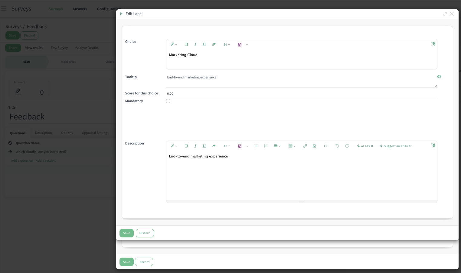
Pen Icon (Edit Choice) in Answers Tab: When you add choices (answers), each choice has a pen icon next to it. Clicking the pen icon opens the detailed edit window for that specific choice.
What you can edit:
Tooltip: Add a hover hint that appears only when the respondent hovers over this choice.
Score: Assign points to this choice (e.g., +10 for ‘Very Satisfied’).
Description: Add a small explanation/text for the choice.
Mandatory: In the Options tab, when you enable the Show Comments Field and check the Mandatory Comment checkbox, you can then decide exactly which answer choice(s) should require a comment. Simply go to the Answers tab and tick the Mandatory column next to the specific choice(s) where the comment becomes required (e.g., only for ‘Other’ or ‘Dissatisfied’). This way, the comment field is only mandatory for the selected answers — for all other choices, it remains optional.
Style: Customize appearance.
Description Tab (for Survey): This is the introductory text displayed on the survey's main page, before the user starts answering questions.

Description Tab (for Question): This is the text displayed on the relative question.
Description Field (for the Choice): This is the text displayed on the relative choice/answer.
3.4 Surveys - Kanban View
Test: Opens the survey in a real end-user view — exactly how respondents see it. Runs in test mode (responses marked as ‘Test Entry’).
Analyze Answers: Opens the survey's results — a dedicated page where you can analyze all submitted responses in detail (e.g, number of answered/skipped responses, pie chart view, data table view, text responses).
Share & Invite: Generates multiple sharing options for your survey to share it with the end-users.
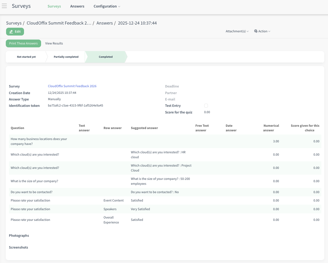
3.5 Critical Fields - Survey Answers
Survey: The name of the survey this answer belongs to.
Creation Date: The exact date and time when the respondent submitted the survey (e.g., the creation of the response/answer).
-
Answer Type: Indicates how the response was submitted:
Manually: Response is not from a contact-specific link.
Link: Response came from a specific survey link
Identification token: A unique token generated for each survey submission.
Deadline: The survey’s deadline (if set in survey settings). Date by which the person can open the survey and submit answers.
Partner: The linked contact/partner record (if the respondent was identified, e.g., via login).
E-mail: The email address provided by the respondent (if collected in the survey or matched to a contact).
Test Entry (checkbox): Automatically checked if the response was submitted in test mode (e.g., while testing the survey > Test Survey).
Score for the quiz: Total score achieved (based on scoring rules set for questions/choices).
Photographs: If the survey is in quiz mode, photographs of respondents’ that are taken during the quiz.
Screenshots: If the survey is in quiz mode, screenshots of respondents’ screens that are taken during the quiz.
Buttons:
Print These Answers: Will navigate the survey user to the answers page (the same page layout when user reviews their answers after submitting the survey).
View Results: Opens the survey's results — a dedicated page where you can analyze all submitted responses in detail (e..g, number of answered/skipped responses, pie chart view, data table view, text responses)
Results View
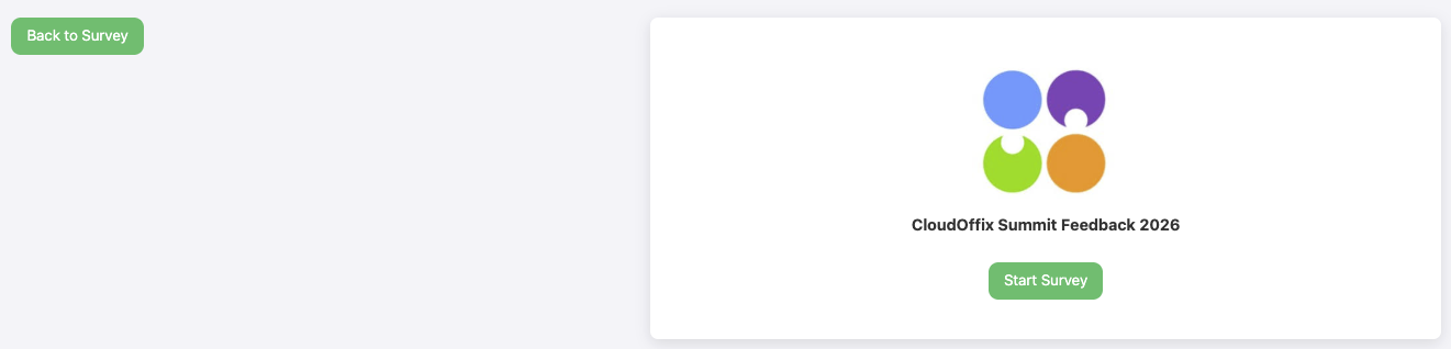
Example Survey Flow
Example Conditional Display
4. Example of End-to-End Workflow
Scenario #1: ‘Collecting Feedback After a Virtual Webinar’
After hosting a virtual webinar, the marketing team at CloudOffix wants to understand how attendees experienced the event and identify potential sales opportunities. One day after the webinar ends, they automatically send a follow-up email from the Events app using a pre-designed email template that includes a link to a feedback survey.
The marketing team then reviews the results to evaluate satisfaction levels, session quality, and suggestions for improvement, using these insights to shape future events. At the same time, key information collected in the survey—such as interest level, company size, or request for a follow-up—is automatically saved on each respondent’s contact record thanks to the “Link to Partner Field” feature. This allows sales teams to instantly see qualified prospects inside the CRM, create leads, and continue the conversation without manual data entry, ensuring smooth collaboration between marketing and sales.
Through this connected process, CloudOffix turns simple event feedback into actionable insights and new business opportunities, completing a full end-to-end marketing cycle from engagement to revenue.
To see an end-to-end marketing management in action, please refer to the following video: [ Marketing Cloud ]