
Overview: The Resource Allocation calendar has been visually refined to improve readability and reduce clutter, especially on days with multiple allocations for the same resource. Previously, short-duration allocations and overloaded schedules were difficult to interpret at a glance. This update introduces a cleaner timeline layout, clearer visual hierarchy, and more intuitive indicators for capacity and overtime.Start writing here...
Updates:
1. Improved Allocation Visualization:
- All allocations up to 1 hour (including 5, 10, and 30-minute tasks) are now displayed using a minimum visual height to ensure readability.
- Allocations longer than 1 hour continue to scale proportionally based on their duration
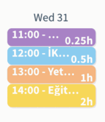%20(10).png?access_token=8c978b1d-cb20-44b4-89dd-daf44c2cfb11)
2. Simplified Timeline Display:
- Allocation blocks now show only start time and duration directly on the timeline.
- Detailed information has been moved into hover tooltips, reducing visual noise.
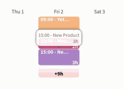%20(11).png?access_token=a8cbaf03-2565-4d14-8ebe-b2bffd46e0f1)
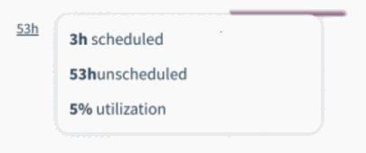
3. Enhanced Capacity & Overtime Indicators:
- UI color codes have been refined to clearly distinguish workload states:
- Red: Capacity exceeded for the selected time period (overtime)
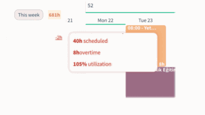%20(12).png?access_token=39e7d9d4-9ab4-46dd-bc08-0a55c2d8d1a6)
- Orange: Partial overtime combined with unscheduled time
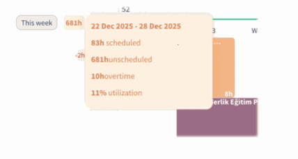%20(13).png?access_token=b1e79f71-1ded-46a7-b6b9-ba6925b82505)
- Neutral colors: No capacity issues
%20(14).png?access_token=f64a1ba7-b279-4c72-8b23-15807031a02c)
Benefits:
• Track Code Changes Better Readability: Short allocations no longer disappear or become visually compressed.
• Instant Overtime Awareness: Users can immediately identify over-allocation and capacity issues.
How it works?
- Open the Resource Allocation calendar in selected time.
- All short-duration allocations appear with a consistent minimum height.
- Hover over any allocation to view detailed information in the tooltip.
- Capacity status is instantly visible through updated color indicators.